Components
The Edge components system is highly inspired by the frontend frameworks like Vue or Svelte. It borrows the concept of reusability, isolated state, props and slots from them.
Do note, Edge is a backend template engine, and we cannot replicate some of the frontend ecosystem principles with Edge. It includes.
- Reactivity: There is no concept of reactivity on the backend. You generate the HTML and send it over the wire.
- Scoped CSS: Edge is not compiled using frontend build tools like Webpack, and hence it does not bother itself with compiling and extract CSS from components. You must use existing frontend tooling for that.
Creating a component
Components are represented using the regular Edge template files. For example, You can create a file named button.edge with the following markup.
<button type="{{ type }}">
  {{ text }}
</button>
And then use it as a component inside other templates.
@!component('button', {
  text: 'Login',
  type: 'submit'
})
The @component tag accepts a total of two arguments. First is the component path (relative to the views directory), and the second is the component state (props).
Components do not have access to the state of the parent template. However, they can access templates globals and locals .
Props
The props are passed to a component as the second argument as an object of key-value pairs. You can access the props directly within the component file by using the object property name. For example:
@!component('button', {
  text: 'Login',
  type: 'submit'
})
Then button component can access the text and the type props as follows.
<button type="{{ type }}">{{ text }}</button>
$props
Another way to access the props is to use the $props property. It is an instance of the Props class
and comes with a few extra capabilities to make components authoring easier.
In the following example, the serializeExcept method will convert all the props into HTML attributes, except the text prop.
<button {{ $props.serializeExcept(['text']) }}>{{ text }}</button>
@!component('button', {
  text: 'Login',
  type: 'submit',
  class: 'py-2 px-8 text-white bg-gray-800',
})
Similar to the serializeExcept method, you can use the serializeOnly method to serialize selected props only or use the serialize method to convert all props to HTML attributes.
Slots
Along with the props, components can also accept slots. Slots are named outlets that the parent component can define markup for.
For example, let's accept the text for our button component as a slot and not as a prop.
<button type="{{ type }}">
  {{{ await $slots.main() }}}
</button>
The component caller can define the markup for the main slot as follows.
@component('button', {
  type: 'submit'
})
  <i class="fa-icon-lock" />
  <span> Login </span>
@end
Main slot
The contents between the @component opening and the closing tag are part of the main slot unless you move it inside a named slot.
All the content outside the @slot('trigger') is part of the main slot in the following example.
@component('modal')
  @slot('trigger')
    <a href=""> Show modal </a>
  @end

  <h1> Modal title </h1>
  <p> Modal content </p>
@end
Named slots
Named slots allow the component to accept markup for multiple outlets. For example, a modal component can accept markup for the modal header, body, and actions.
<div>
  <header>
    {{{ await $slots.header() }}}
  </header>

  <main>
    {{{ await $slots.main() }}}
  </main>

  <footer>
    {{{ await $slots.actions() }}}
  </footer>
</div>
You can verify a slot existence and give a fallback value using an if statement.
<div>
  <!-- ... -->
  <footer>
    @if($slots.footer)
      {{{ await $slots.footer() }}}
    @else
      Default footer
    @end
  </footer>
</div>
The parent template can define them as follows.
@component('components/modal')
@slot('header')
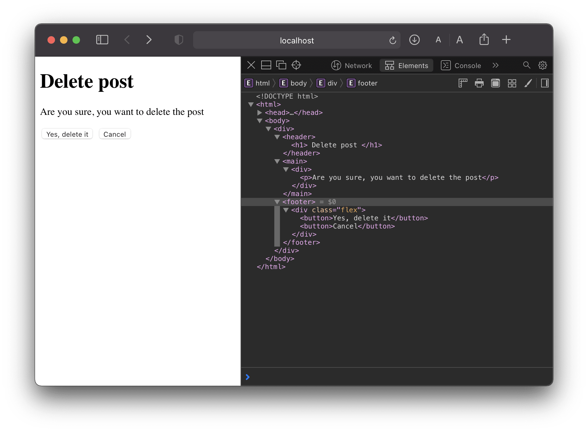
<h1> Delete post </h1>
@end
@slot('main')
<div>
<p>Are you sure, you want to delete the post</p>
</div>
@end
@slot('actions')
<div class="flex">
<button>Yes, delete it</button>
<button>Cancel</button>
</div>
@end
@end
Output
Slots scope
The slots have access to the state of the template in which they are defined (aka the parent template).
Following is the markup for the button component
@set('title', 'I am a button')

<button>
  {{{ await $slots.main() }}}
</button>
The parent template is attempting to access the title property defined inside the component.
@component('components/button')
  <span>{{ title }}</span>
@end
<button>
  <span>undefined</span>
</button>
You can pass the data from the component to the parent as arguments to the slot method.
@set('title', 'I am a button')

<button>
  {{{ await $slots.main({ title }) }}}
</button>
@component('components/button')
  @slot('main', scope)
    <span>{{ scope.title }}</span>
  @end
@end
To summarize:
- Parent template can pass data to the component using props or slots.
- The component can pass data only to the slots as arguments.
Injecting data to the component tree
The data injection API of Edge is inspired by the Svelte context API and Vue provide/inject API .
The goal is to simplify the communication between the components inside a tree. However, note that this is an advanced API and must only be used when you are self-authoring a group of components and want transparent communication between them.
Basic example
Let's start with the most basic example to see the injection API in action. You can make use of the @inject tag to share an object with the component tree.
{{-- Declare a local variable --}}
@set('counter', { value: 0 })

{{-- Inject it to the components tree --}}
@inject({ counter })

{{{ await $slots.main() }}}
Since the @inject tag shares the object by reference, any part of the component tree can mutate its properties, as shown in the following snippet.
The injected values are available on the $context variable.
@component('components/parent')
  <p> Value of counter is {{ $context.counter.value }} </p>

  {{-- Bump the value by one --}}
  @set($context, 'counter.value', $context.counter.value + 1)

  <p> Updated value is {{ $context.counter.value }} </p>
@end
Components as tags
Edge allows you to reference the components stored inside the ./resources/views/components directory as Edge tags.
Create the following template inside the resources/views/components/button.edge file.
<button type="{{ type }}">
  {{ text }}
</button>
Now, instead of referencing the button component using the @component tag. You can also reference it as the @button tag.
@!button({
  type: 'primary',
  text: 'Login'
})
You can reference the components inside the nested directories with a dot notation. For example, the file stored inside the ./components/form/input.edge is referenced as follows:
@!form.input({
  type: 'text',
  placeholder: 'Enter username'
})
Following is a reference table to understand the transformations applied to the component path to compute the tag name.
| Template path | Tag name |
|---|---|
| form/input.edge | @form.input |
| tool_tip.edge | @toolTip |
| checkout_form/input.edge | @checkoutForm.input |